

Responsive Web Redesign
CLIENT:
AGENCY:
Mid-America Apartment Communities
DATE:
Huge Inc.
ROLE:
Dec. 2017 - Sept. 2018
Experience Lead
Research, Wireframes, Prototype
OVERVIEW
Mid-America Apartment Communities (MAA) is the largest apartment owner in the USA. They own 320 communities across 17 states. MAA came to Huge with a goal to redesign their www.maac.com website, which, although had been redesigned in 2014 was performing at industry low speeds with high bounce rates, had a limited search experience, and cold, uninviting content amongst other issues.
Their aspiration was to bring the digital experience of apartment hunting up to the level of sophistication of their customer experience. We worked closely with MAA to revitalize the site’s look and feel, create a better experience for the user and design it to work responsively across all devices.
DISCOVERY
To begin, we conducted a thorough audit of the current experience. During this phase I like to print out and pin up users flows in order to have meaningful conversations with the team regarding the issues presented and how we might make improvements.

Observation: User cannot convert on mobile
Observation: Search experience is limited to only name and city
Observation: <1% of users can find neighborhood information
Observation: Most property
details are populated by
3rd party APIs
Observation: Compare tool UX
is confusing and unhelpful
Other activities conducted during the discovery phase included user research with apartment dwellers, interviews with various stakeholders within the MAA team (from on the ground leasing office agents to the CEO), off-site touring of different apartment types, reading through secondary research, and looking at competitors. Competitors included direct (other real estate investment trusts), indirect (aggregators, one-off apartment complexes), and other related industries (hotel, hospitality, etc.)
Stakeholder Interviews
38
Conducted interviews with MAA employees and 3rd Party Vendors.
Competitive Analysis
1
Analyzed findings of over a dozen direct, indirect and related competitors.
Property
Tours
3
Visited different types of MAA properties to gain a better understanding of the product.
Materials
Reviewed
57
Reviewed and gathered insights from 57 documents sent over by the client.

USER
RESEARCH
45
Participants
3
Days

Methodology: Online bulletin boards (qualitative), 3 days
We conducted research to gain insight into customers’ experiences, desires and needs around apartment hunting in order to inform our strategy. With the same audience we also took the opportunity around the do user testing with the pitch creative in order to gather reactions and validate some of our initial assumptions.
Role: During the research phase, I identified the objectives of the research, helped prepare the screener, assisted in moderating the bulletin boards, analyzed the conclusions from the findings and presented them to the client.
Apartment hunting is a highly emotional experience.
"I hate when there are major discrepancies between what you read online and when you call. I want apartment complexes to be transparent about their prices and fees"
-Melissa R.
Research Participant
Community is key.
Many of the participants desired a sense of community where they live, intimating that such a feeling contributed directly to their needs for safety, security, and well-being.
CONCEPTING
As Experience Lead, it was my role to both contribute wireframes and to oversee the Visual/UX designers on the team and guide them through their own explorations. I spent a lot of time providing feedback and helping to use the strategy to inform our decision-making.
Here is a sample of wireframes I created representing different parts of the experience.


before

MAXIMIZING CONVERSION
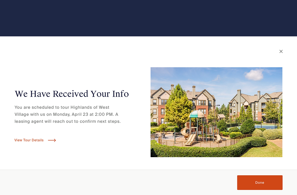
In order to introduce our apartment hunters to the new scheduling tool we implemented a sticky navigation bar on the property detail page providing multiple ways to contact the property.
%20%5E.png)


KEY PAGES

Through research we identified the two key pages to use our focus our time and effort on. The first being the property detail page, where a majority (82.1%) of current apartment seekers enter the site. This insight indicates that a majority of users are already lower down the funnel of their search and already seriously considering this property.


However, the behavior of the of users who entered the site through the city landing page spent a much longer time on the website and showed an increased likelihood of converting, thus making them a equally important group to target.
VISUAL DESIGN
Our core design objectives were the follow: 1) Maintain simplicity, 2) Inspire confidence, and 3) Spark emotion. Maintaining simplicity meant eliminating walls of text and 20+ image carousels and creating scanable pages with compelling, concise narratives that a user could consume at a glance. We wanted to inspire confidence by updating the overstated copy with language that felt genuine and forthcoming, as well as providing them with easy ways to get in touch. Finally, we wanted to spark emotion by providing the user with a vision of what their life could be like living at an MAAC property through lifestyle photography and neighborhood information.

Property Detail Page - Before

Property Detail Page - After

%20%5E.png)


